Well, what's more historical drama than 'the shot heard around the world', and all the kerfuffle that followed? Plucky settlers taking up arms against the 'tyranny' of their King and heavens forbid, taxes to of course replace it with republican Democracy and....taxes. Alas, American Revolution movies seem to be lacking in bringing this fascinating era to the silver screen: looking at you, Mel Gibson and The Patriot.
One of my aims this challenge was to try some new approaches to paint quicker, and thus get more done. Especially after last challenge, which was a bit of a damp squib in terms of output. One of those I wanted to try was 'slapchop', the stupid name for a drybrushed variant of the old masters' 'grisaille' method of underpainting, then highly pigmented washes to try to skip time-consuming highlighting. Dreamed up with catchy slogans like 'slay the grey', and the subject of many excitable/raging YouTube videos late last year, debating whether its the best thing since sliced bread, or a load of old cobblers.


Is this the method for me to cruise though the pile of potential? Mmmmmm, I’m not convinced, while the test mini went well and was finished in an evening, with this a sizeable batch, I rapidly came to dislike the process. So much so that I started them on 21 December, parked them in mid-January completely, before the end of the Challenge became pressing enough for me to dig them out to finish off.
Alas, I've a firmly established method, where I lay down basecoats, then tidy up the mess I make as I highlight them up. Making a mess with Contrast puts me in a right pickle. I feel my work on the WWII French - also rapid, using drybrushing to save work and time - was much more enjoyable approach, and came out with a better finish (though in fairness, a much simpler colour scheme)
Don't get me wrong, it's horses for courses and if approaches like Slap-chopping help hobbyists get stuff on their paint desk, that's awesome in my book. For me, Contrast paints still have their uses, like picking out little details that would be barely noticed, like boots.
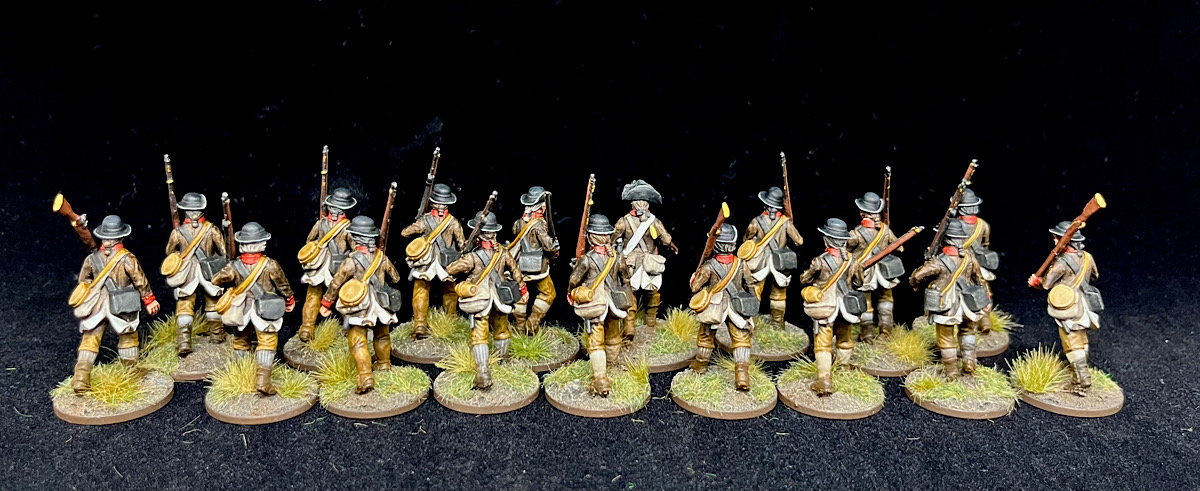
Sixteen 28mm miniatures, as the leader was the test model and painted before the Challenge. 20 points for the Studio bonus is another 100 for my tally (two 100-pointers in one Challenge, look at me go!) Over 600 now and cruising towards what I suspect might be an all-time high score for me.

So this is weird, I've posted this and then it reverted to draft. Will try again. Love the figures by the way
Great troops, Phil! :)
ReplyDeleteThanks Tamsin!
DeleteNicely done, and nice to see some of the brown jacketed AWI. I share your derision of the title 'slapchop', and jury is still out as it being the best thing since sliced bread - will see (I'm like you, have used a hybrid technique). I want to see how it goes on small scales. Experiments will continue
ReplyDeleteHah it’s more derision at the tone of the discourse, than the technique itself. But thats my take on most opinions on the internet things.
DeleteLovely filthy rebels, Phil! 'Slay the Grey' indeed. :)
ReplyDeleteSlayed it this challenge, for sure.
DeleteExquisitely painted Phil
ReplyDeleteHah I wouldn’t say that but they aren’t too shabby
DeleteGreat work. I’m still unsure as well on the contrast front. Seems to work and then I go back to old ways. Love the figures and enjoy the different units. Well done.
ReplyDeleteCheers Bruce. They have uses for me, just maybe not as the creators intended.
DeleteWell I think they look pretty cool, Phil.
ReplyDeleteThanks Ray!
DeleteVery nicely painted unit
ReplyDeleteCheers :-)
DeleteI think they look great!
ReplyDeleteThanks! I’m satisfied, if not that excited by the outcome.
DeleteOoh! I quite like these, Phil! It is also wonderful to see something other than Washington's Contiental troops. There is a lot of color in the Revolutionary War besides grenadier red and colonial blue. Wonderful to see some other regiments get time in the limelight! ;)
ReplyDeleteI have an old poster with museum and wargamer figures for a post office review war stamp run from the 90s and there is a treasure trove of color and uniform styles!
Oh yes, a friend of mine (and the Perry pamphlet) show the baffling array of uniforms they were trying in the Continental Army. I’ll concede the classic blue and red or blue and white looks are very snazzy so I’m not surprised they stick in everyone’s minds.
Delete