Three posts in 1 day!!!
And its more 2mm WSS goodness (no DaveD, they're not bits of card either)
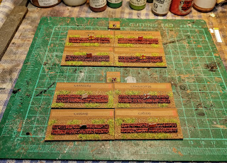
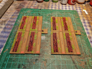
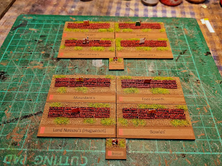
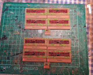
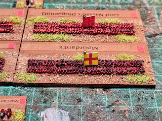
Here we have 2 Brigades of English foot, MacCartney's and Breton's
Each unit consists of 240 2mm figures
In a previous post I hand written the names of each unit on the bottom of the base. Unfortunately my handwriting is like a 5 year old's. So after a quick experiment on MSPaint, I came up with these, the brown colour is a close match to the brown on the bases and they don't catch your eye too much. Which is what I wanted.
I did add a coloured block on the left of the label, to denote the country of the unit. Red being English.
McCartney's Brigade - Gorge's, Breton's, MacCartney's & Portmore's
Breton's Brigade - Mourdant's, Foot Guards, Lord Nassau's & Bowles'
Don't look too close, 2mm are hard to see let alone paint!
All the flags come from my NYW collection and were shrunken down to fit 2mm. Now they are larger than they should be, but in my opinion need to be.
So for the points
8 bases @5 pts each = 40 pts
2 bases @1/2 pts = 1 point
For a total of 41 points!!!
Lovely work, Ray. I love how you painted the eyes on each individual model. That takes some real dedication. The printed labels do look easier to read than the previous ones.
I've thrown in an extra point for the banners, even if they aren't scale accurate.
Fabulous Ray, I must say really cranking these out
ReplyDeleteCheers
Matt
I'm giving it a go Matt.
DeleteLovely work Ray. I think the labels look better and don't distract from the mini's. 👍👍
ReplyDeleteIndeed!
DeleteGood looking unts, I like the labels.
ReplyDeleteThanks Teemu!
DeleteNicely done, Ray! :)
ReplyDeleteThose printed labels are a big improvement. I do wonder if flags might be a better option than squares of colour to identify the army?
I did ponder that question, the main problem it all the countries had a white Kings colour, so it'd be just as difficult to tell them apart, as if I just left the plain label. I'm not 100% ok with the colour block myself to be honest?
DeleteNice workRay, looking really good. Love the flags. Unit labels are a big improvement. FYI I colour code the background of the label to identify the army/force etc.
ReplyDeleteThat's what I didn't want to do, I wanted the label to blend in with the base and not stick out, so you noticed the label rather than the figures.
DeleteThey look great again, the flags are a nice touch and the labels are much better!
ReplyDeleteYeh, I think so too.
DeleteBeautiful work. I like the brown labels.
ReplyDeleteI think they blend in quite well.
DeleteI certainly like this project, Ray! They look brilliant and my old eyes appreciate the labels and oversized flags! Nice work on the true 1st world War!;)
ReplyDeleteStunning Ray, stunning!
ReplyDeleteBrilliant Ray, not sure how you do it though - great talent no doubt
ReplyDeleteThose are some tiny figures, Ray. Brilliant job.
ReplyDelete