
Here are six Imperial Roman officer-types that I’ve done up for an upcoming skirmish game I have planned for the guys. I think they are a mix of Centurions and Optios. To be clear, I’m not very knowledgeable with this period so the specialists out there will have to cringe and forgive me for my Hollywood 'swords-and-sandals' interpretation of their uniforms and kit.

These are a mix of 28mm Foundry and Warlord miniatures. Very nice sculpts on the whole, though the Warlord castings required some careful cleaning to get them looking respectable before priming.

Painting went reasonably well, but then came the shield decals… Oh. My. God. First I have to come clean by stating that I always seem to have a problem with decals. They stick to nothing except my fingers, they tear apart, they get bubbles, they float away... the list goes on and on. Also, I made the mistake of tying to make use of some old decals I had picked up from Foundry years ago. They are the old style, you know, with the cut-outs for the central shield boss and the artwork applied to one sheet of adhesive. As Gollum would say, ‘I HATES them!’ Then, to top it off, I discovered during mid-application that the Warlord models have shields that are slightly smaller than the Foundry castings so the decals wouldn’t have fit on them in the first place... To say I lost my sh*t is perhaps overstating the case, but I came darn close. (My dogs, the poor fellas, scampered to another room to escape the blue fuge of my rage-filled cursing.)
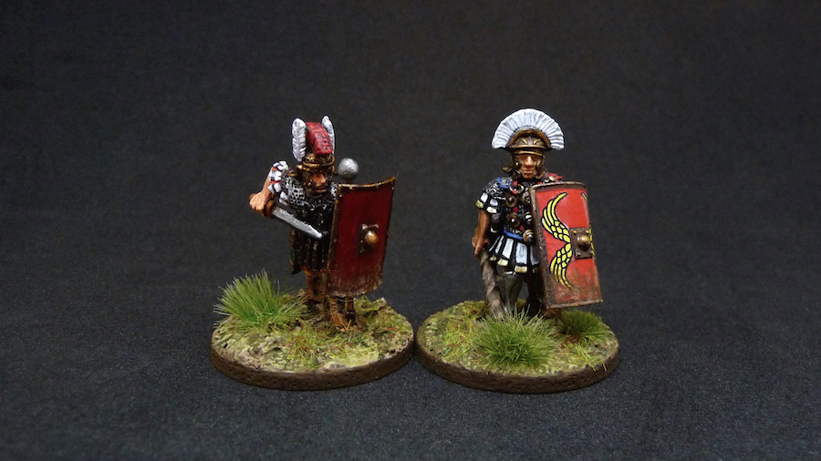
Anyway, I apologize for presenting some undecorated shields but I am SO DONE with these guys and I need to move on to something else. They will have to live with plain red planks until I can get some proper shield transfers in the New Year. Sigh. 'Nuff said.
30 points for me. (Harrumphs irritably as he stalks back to his hobby desk...)
I like them. They look really, really good despite your encounter with decals. Those Warlord metal castings require a lot of clean up. What's up with that? Be nice if they fixed that one day. cheers
ReplyDeleteThanks Brendon. Yes, I hear so much about their poor casting quality that it makes me wonder what the deal is. Meanwhile there are other firms, Empress for example, which consistently turn out very nice models requiring very little cleanup. I'm sure there's a very interesting backstory to this (well, interesting to me I guess).
DeleteDespiteyour little dilemma regarding the decals (LBM is the way to go here) these guys came out great. I really like the vibrant red you used. Very cineastic ;-)
ReplyDeleteThanks Nick. 'Cineastic' now, there's a cool word. I looked it up - is it uniquely German? Gotta remember that one for the next cocktail party...
DeleteHmm.. my sincere appologies ;-) it really seems like cineastic (actually cineastik) is a uniquely German word but with it's roots in the french cinephil. It sounded so English to me I assumed it's beeing a common English term. Actually it means 'cinematic'...
DeleteThose helmets seem to scream out "Hollywood" just with the way they are sculpted. Painting them in muted tones would be WRONG.
ReplyDeleteThe weathering at the bottom of the shields where they would catch the blows of an enemies swords is really nice.
Ha! You're right Anne, they are movie helmets to be sure. I actually have one of those helmets sitting on one of my bookshelves - it's from the set of the HBO series 'Rome'. Its freaking HUGE and highly dorky.
DeleteI've never been brave enough to use decals for shields, so hats off to you, Curt! The ones you have applied certainly look the bees' knees from here.
ReplyDeleteLovely painting of some very inspiring poses. I'd defy a young recruit not to charge into danger with these chaps leading!
Actually I've used the LBM decals and they are an entirely different beast. Even muppets like me can use them without f*cking it up. :)
DeleteNice work Curt, I can live with a plain shield or two!
ReplyDeleteThanks Ray, that is what I thought as well...
DeleteThey look good to me. (also no expert). And I would be happy if I had painted them.
ReplyDeleteThanks Clint, very kind of you.
DeleteLooking good! From my expert knowledge gathered from watching Gladiator they are spot on :)
ReplyDeleteToo bad for the decals. Crappy ones can really drive you crazy. Who would have thought that there could be so much quality variation in something as simple as decals.
Haha! Yes, that is precisely the look I'm going for.
DeleteI should have known better to try to use these older decals - I thought I was too clever by half. Think again!
Excellent work on those, Curt. I'm surprised how well Foundry and Warlord mix.
ReplyDeleteYes, me too. I thought there would be more difference but these mix very well indeed.
Deletegreat job, but it seems to me, on the shields could cause damage
ReplyDeleteThanks Alex.
DeleteVery nice.. And aargh decals.. Yup I get your frustration , it seems to happen to me too
ReplyDeleteGood to know that I'm not the only one who hits the wall with these damnable things.
Deletevery nice indeed - the bright colours are exactly what I'd do and will look great n a skirmish game.
ReplyDeleteAs noted elsewhere, the weathering to the bottom of the shields is top notch - consider the idea stolen for when I next tackle some shields.
Thanks Jamie. I saw this shield effect in a magazine and have been hooked ever since. It somehow looks so badass.
DeleteCurt
ReplyDeletethink these are great, I love contrasting colours on feathers and head dresses. I always play fast and loose with colours on these types of figures - it's not like there are photos to go from - even the historical record uses artistic licence.
I also hate decals - I have some samurai banners that look like I just dipped them into a bowl of free floating decals.
Top job
Thanks for the kind words Martin. They will be easy to see on the tabletop with all that technicolour plumage, that is for sure.
DeleteGreat work Curt. As it's for skirmish gaming with friends, a dramatic look is fine...
ReplyDelete...provided none of the friends are Roman rivet counters ;)
No rivet counters in this group - I had them shot years ago. ;)
DeleteGreat work - the figures look great. It's also heartening to hear that a master painter like yourself can struggle sometimes with an aspect of the 'craft - it's a reminder that our little hobby is one where the honing of our skills is a journey without a destination - we can always improve.
ReplyDeleteAnother +1 for Little Big Man Studios shield transfers - easy to apply, the look great and they are easy to trim to fit shield size variances.
Ha, you flatter me Miles but thank you. Our hobby is a journey to be sure and somedays that journey takes you through a border-post with guards who indulge in cavity searches. ;)
Deletewell worth the effort as you have done them proud
ReplyDeleteIan
Thanks Ian!
DeleteNicely done.
ReplyDeleteAnd I'm so-oo glad that I never got round to painting my EIR figures, all with their foundry decals, if what you've said is anything to go by :)
Yeah, I recommend ditching them and going with the offerings from LBMS - those things are a dream in comparison (though I often manage to bugger those up as well).
DeleteI sympathize with your decal struggles... Its what has lead me to hand painting my dark age shields (which has its own struggles). I like them, honestly I think a Hollywood interpretation of many uniforms, especially for Ancients and Dark ages is fine... especially as lot of miniatures for those periods often seem to match those same movies more than historical examples.
ReplyDeleteThanks Adam. If I had better brush control I'd try freehanding them but I know I couldn't manage it. I greatly admire anyone (like yourself) who can pull it off.
DeleteThey look great to me! No matter what the historians may say I'll always see those helmet crests as red and white.
ReplyDeleteCheers Brian!
DeleteThey are very nice, Curt. Look always for the LBM decals, they are very good.
ReplyDeleteI know! I should have just sucked it up and ordered a bunch of LMB sheets. Lesson learned...
DeleteWell done on these Curt!
ReplyDeleteChristopher
Thanks Christopher.
DeleteThese Romans look great, excellent job!
ReplyDeleteCheers Phil, they were a bit trying but I'm happy enough with them.
DeleteI've got some decal work looming for my next project. Hopefully you soaked up all the bad Decal Karma for this month and I'll get along swimmingly.
ReplyDeleteAt any rate, the decal drama should by no means overshadow the fantastic work on the figures. They look great! I particularly like the fellow with the two-handing "bonking stick" (or, to use its Latin name, stickus whackus).
Oh, I'm sure I slurped enough bad decal karma for a few people. Have I mentioned I hate the things? You should have smooth sailing with your efforts.
DeleteWell done dude. And I'm always glad to read of someone else's hobby "passion" (ahem :)
ReplyDeleteI thought you'd appreciate me snapping my crayons over these little b@stards...
DeleteLovely stuff, Curt. They have a very cinematic quality to them. I especially like the guy with the big metal ball on the long stick - I'd hate to have him as my Drill Instructor.
ReplyDeleteYes, that thing looks rather nasty doesn't it. They must have had lackeys that kept the things polished within an inch of their lives.
DeleteROFLMAO. That made my day! I feel your pain re decals mate, I hate the bloody things too. I strongly suspect they are some sort of conspiracy.
ReplyDeleteDespite your suffering these have come out a treat and who cares if they are that accurate or not? I think my favourite is the chap with the transverse feather crest, but then I'm a sucker for anything red and white :-)
I'm glad my misery had a silver lining. ;) The transverse guys are my favourite as well. I especially like the guy who is marching in with nothing but a vine branch - now that is one serious HARDASS.
DeleteSweet! These are excellent.
ReplyDeleteCheers, Ross
Thanks Ross, I'm happy you like them.
DeleteThey look terrific Curt, I especially like the weathering at the bottom of the decal-less shields. I despise decals, because I can't make them work. You probably paint better than some stupid decal anyway.
ReplyDeleteLOL! Geez, I hope I do paint better than a decal. ;) Though I sure I don't have the same snappy personality...
DeleteSeriously, hanks for your thumbs up BaconBuddy.
Although you had "issues" with the decals, they do look really nice and bright with the plummage! Officers luv da bling! ;)
ReplyDeleteI am going to learn adequate freehand if for no other reason than my skill with decals are worse than yours!
The only time I ever got it right was with some Crimson fist marines. I even carefully cut them to wrap around the shoulder plates and removed bubbles n creases. Highlights, lacquer, fixitive...more time than painting the figures. They spent a year in a Sabol case within the shed while I was deployed.
My crimson fist foam trays are the ones with mini red fists all over the foam!
Ha! Yes, I HATES IT WHEN THAT HAPPENS!
DeleteThanks for the commiseration David. :)