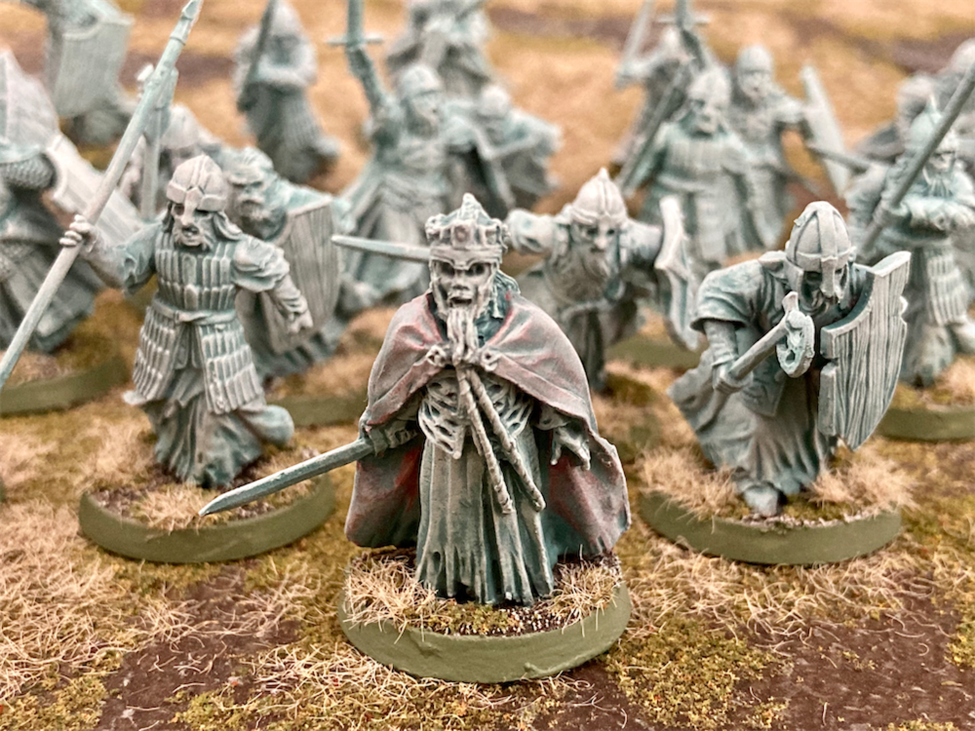

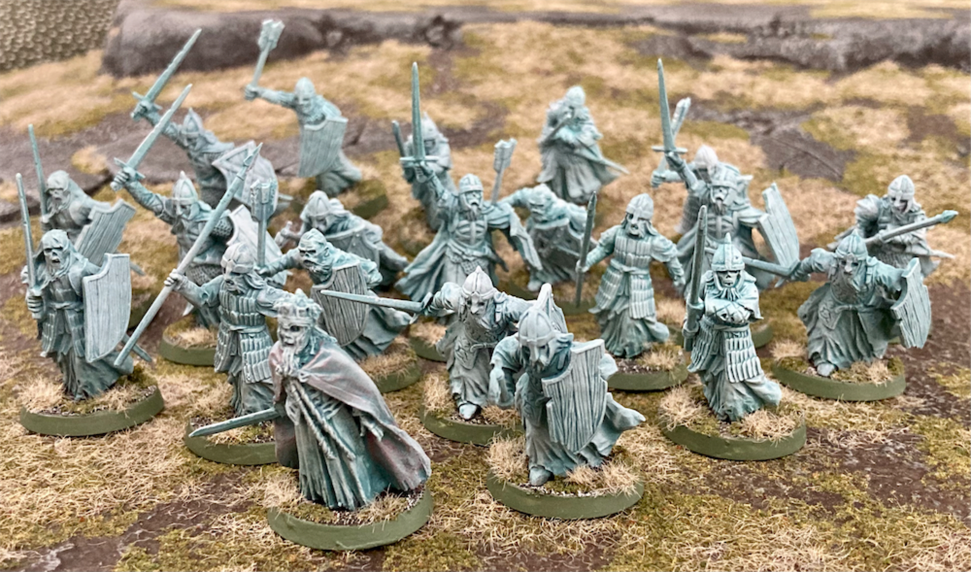
I wasn't sure how to paint these: film-accurate greenish or a more pleasing verdigris-blue tone. I did a test between two different Contrast paints over a white undercoat, then drybrushed Army Painter Spaceship Exterior. I settled on blue-grey Briar Queen Chill over green Hexwraith Flame.

 |
| Hexwraith Flame vs Briar Queen Chill, both drybrushed grey |
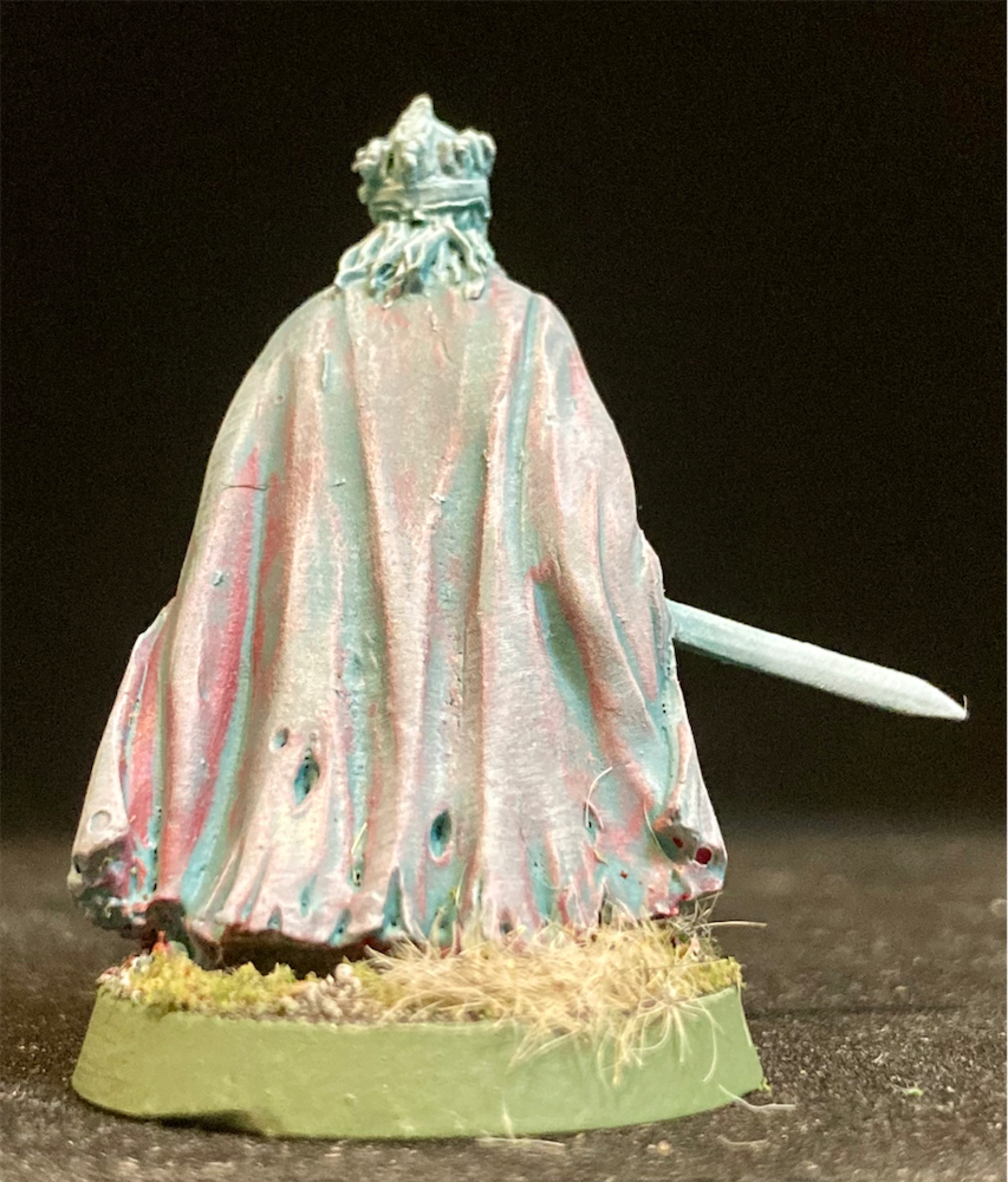
In The Return of the King (2003), the King of the Dead has a red hue to his cloak. I painted this with Flesh Tearers Red before the same application of Contrast and drybrush as the rest. It is subtly different and I'm happy with the outcome.
 |
| Before |
 |
| After Briar Queen Chill and drybrush grey |
21x 28mm figures (105 points)

Lovely work on these ghostly chaps, Barks. I agree that the blue-grey works better for them than the green. The king's cloak has just enough red showing through to stand out, but not enough to overpower the colour scheme as a whole. 105 spooky points well earned.
Very nice Barks - and thanks for sharing the different painting recipes!
ReplyDeleteI wanted to earn the five points per model for a super easy job!
DeleteVery nice job! Briar queen chill was the right choice. I will have to use this formula myself.
ReplyDeleteIt is a recent addition to the Contrast range, and as soon as I saw it I knew I would use it for these chaps.
DeleteLiking these. They came out very well, especially the red cloak
ReplyDeleteThanks, Peter!
DeleteGreat work Barks, love the contrast over a coloured base - will have to give that a try some time
ReplyDeleteI was impressed at how well it covered a vibrant colour.
DeleteNice spooks, Barks! :)
ReplyDeleteThanks, Tamsin!
DeleteI have a bunch of these to paint and I like your "recipe"- I think I may pinch it, as yours turned out great.
ReplyDeletePlease do!
DeleteLovely work Barks. I've always liked these figures. Great tone you've achieved. I wonder what a mix of the two would look like? I like using Contrast over established colours as it can give some very cool results, like you've achieved here.
ReplyDeleteI think there are some very cool combos and effects that could be achieved- but speed was important here!
DeleteGood end choice of colour …
ReplyDeleteI don't have second thoughts, here!
DeleteThose really are excellent and its interesting to see the thinking behind the paintwork
ReplyDeleteI hope it is useful!
DeleteYeah, I'm with you here. Blueish ghosts look better and that red cloak is ace. Well done!
ReplyDeleteThank you! The green is a bit Scooby-Doo-ish.
DeleteLovely choice of colours and a great result!
ReplyDeleteBest Iain
Thanks, Iain!
Deleteawesome oathbreakers Barks!
ReplyDeleteCheers, Sander!
DeleteYes nice stuff and agree with your choice for the final colour!
ReplyDeleteCheers JezT
Thanks, Jez!
DeleteThey look great. I like how you have done the cloak. I found trying this ghostly colour is harder than it at first looks to be.
ReplyDeleteI did want to get it 'right'.
DeleteGreat choice of colour, the king’s cloak looks very good!
ReplyDeleteThank you!
DeleteNice work. Great choice of colours, really evocative of the movie feel
ReplyDeleteThey really are a toxic green in the film.
DeleteThese came out great, I think you chose the right colour for sure. Nice touch on the king’s cloak too
ReplyDeleteIt was a bit of a gamble but it paid off.
DeleteNice job, Barks. Makes me want to run and and buy some for my LotR collection.
ReplyDeleteThey're satisfyingly quick!
DeleteWell done. Thanks for the paint explanations. Very helpful for future endeavors
ReplyDeleteGlad to help!
DeleteGreat effects, great looking unit.
ReplyDeleteThank you very much!
DeleteLoving those Barks, really like your cape
ReplyDeleteCheers
MattW
Thanks, Matt, I was pleased with the end result.
DeleteExcellent brushwork Barks!
ReplyDeleteCheers, Ray!
Delete